For International Women’s Day, let’s celebrate Margaret Calvert - a graphic designer with a career spanning six decades. Her designs, although you may not realise it, relate not just to rail and road but our wider lives.
Margaret created information systems which help guide people through their environments, known as wayfinding. This applies to any situation whether you are driving along a road or navigating your way through a hospital. Many of her designs are still in use today, decades after the original design. Fonts are often taken for granted, and by design blend into the background. She produced many examples with a variety of uses: in transport, on websites and within the NHS.
Reinventing road signs
Margaret studied at the Chelsea School of Art in 1957, specialising in illustration and printmaking. Along with her colleague Jock Kinneir, she was commissioned by the Ministry of Transport from 1958-1965 to create new road signs. This work was vital, with the first full-length motorway in Britain (the M1) opening in 1959. There was an urgent demand for clear and consistent signs to replace the dangerous existing signs.
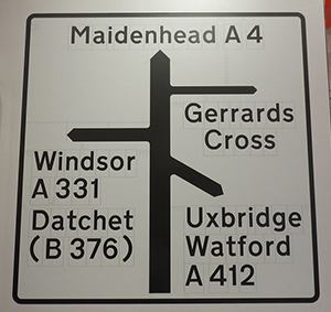
Signs had previously been capitalised, but Margaret and Jock introduced new upper and lower case lettering. The mix of lettering helped drivers recognise the shape of the word faster - very important when whizzing down a motorway! White lettering was key to making sure the signs could be read at night, to reflect light from headlights.
The letters were also set out in a tile system, to make sure the spacing was consistent. The signs themselves were often three times larger than previous versions - leading to complaints during testing the signs were too big. This road sign system is still in use today, and has been replicated worldwide.

"Margaret Calvert Road Signs" by hindsightery is licensed with CC BY-NC-SA 2.0. To view a copy of this license, visit https://creativecommons.org/licenses/by-nc-sa/2.0/
Some familiar signs
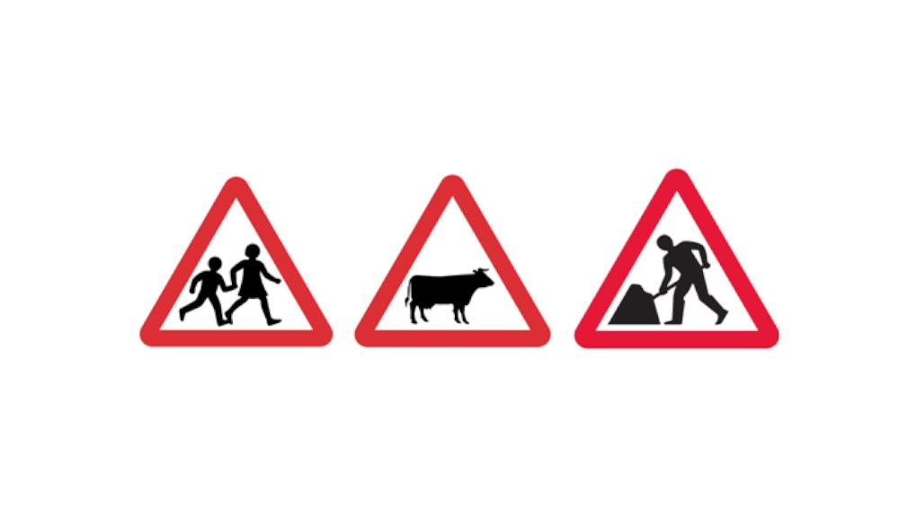
Margaret designed many of the pictograms which are still in use on road signs today. This includes the Children Crossing sign – she based the image of the girl on herself as a child. The cow featured on Farm Animals sign was inspired by a cow on her relatives’ farm. Margaret was quoted as saying she regretted not including a corner of a spade on the ‘men at work’ sign - to avoid jokey comparisons to an umbrella!

Fonts and their uses
The font New Transport was originally designed in the 1960s to be used on motorways and the usage expanded to all roads. With some minor modifications, it is still in use today. In 2012, the font was adopted by the Government Digital Service and used on the single government website, gov.uk.
The typeface Calvert can be seen on Newcastle’s Tyne and Wear Metro - it was originally designed for a French town but rejected for being ‘too English’. The same font is also used by the Royal College of Art for their logo. Margaret taught there for over 40 years, as Head of Graphics from 1987 to 1991.
Rail Alphabet
Designed to be read by slow-moving pedestrians, Margaret and Jock worked on the new font in the 1960s to help create one overall design for British Rail. This was seen as the standard for railway graphics across Europe. The font has also been used on NHS hospital signs, airports such as Heathrow, Sydney, and Bahrain, the old Sealink ferries, and Danish rail company DSB.
Rail Alphabet 2
Margaret and Henrik Kubel were commissioned by Network Rail in 2019 to create a new typeface that related to the original Rail Alphabet. Signs needed to consider accessibility and have a visual impact, without clutter. The first station to use the new Rail Alphabet 2 font will be London Paddington. The redesign also included new pictograms for the modern age such as cycle hire or Wi-Fi, which still needed to harmonise with existing signs.
Known for creating ‘a house style for Britain’, Margaret Calvert’s innovative designs and work in a traditionally male dominated field have changed the way Great Britain and the world looks forever.


